Saturday, June 11, 2011

It's done and I heart it

Share
It is raining outside, I skipped my 10k in Portsmouth, the party I was going to today was cancelled (luckily there is another one tonight that we are going to instead) and I cannot seem to get myself to go for a run in the rain...so why not finish the heart wall project?!

Here are the supplies I had handy.
  • Clear ruler & protractor
  • Pencil
  • Measuring tape
  • Laser level
  • Random sized books and magazines
  • Ironing board
  • Gloves
  • Scissors
  • 3M Command Tape (small)
  • Image of heart wall laid out on floor
  • Pictures for the wall of course


After planning out the layout of the wall explained here, I ordered the images and laid them out on the floor and took a picture with my phone. This proved to be a very helpful step as I slightly altered my original design by adding a row (because it looked better in person) and I referenced the layout before starting each row on the wall to estimate what the image spacing should be.

I started with the longest row of images and set a laser level to the be aligned with the top of the first row of images. After I had the first row established, it was not really necessary to do this for every row. I think I did it for the 3rd row down just to make sure I was still on the right track. Even then, it was hard to align at exactly the point at which the top of the images should have been as seen in the photo below.

Although I did not use the ironing board, it would come in handy if I had any rows of images that were higher than the 2nd floor. I could have adjusted it exactly to the height that the laser level needed to be at.


I originally was thinking of using silver thumb tacks to put the images on the wall, but after going to both Target and Lowe's and discovering that silver thumb tacks are more rare than I thought, I went with 3M Command tape. Plus, I liked the idea of not putting a hole through the pictures or having to fill in the holes! Woo to the hoo. 

I decided that each Command strip cut in half vertically would be plenty to hold up the images. I placed each half in the upper corners of the photo. 


After placing the strips on the photo, I adhered the image to the wall. I used a cloth (or you could use gloves) to press them into place. All rows are pretty evenly spaced at 1 cm apart, but the horizontal spacing varied depending on how the heart needed to come together. This is where the layout came in handy.


Fifty seven images and 3 hours later, my heart wall was complete! 


Overall, I'm very happy with the outcome! 

Have any of you attempted this project or have plans to? How did it turn out?

Sunday, June 5, 2011

Back to the deck

Share
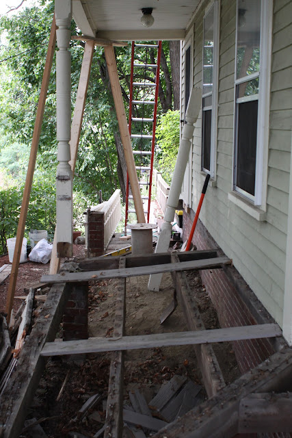
We tore down the wrap around porch last year and winter sort of got in the way of finishing it. I'm happy to report that now that the man room re-do is coming to a close, we (and by we, I mean Kevin in this case) are picking up where we left off. 


Here are some pics of deck building fun from late last year.


It seems he's dug himself a hole that he can't get out of.


I have crazy concrete tube arms, now give me some candy!


Neighborhood watch


Here are some pics of the old deck.


As you might imagine, the whole thing had to go and is being very carefully planned out and constructed with care!

Saturday, June 4, 2011

Meet the heart wall project

Share
I am obsessed with Pinterest. Yes, obsessed. Pinterest is a place to catalog images from the web or that you take. You 'pin' them to your own boards and have the ability to see others' pins and repin them to your own board.


I really need to devote a whole post to Pinterest so I'll save my love letter to Pinterest for later. For purposes of this post, you really just need to know that I got the idea for a 'heart wall' from Pinterest and it came from an apartment in Paris (that is just to make it sound cool).

I have been struggling for years with what to do with the stairway wall that goes from the 1st to the 2nd floor. It is a blank canvas with so many options. You can see what the 1st floor hallway looks like here and 2nd floor colors here. My thought was always to do a large scale frame installation, but I was afraid of messing it up, I couldn't decide on the images to display, I would have to buy a ton of frames, I didn't know what frames to buy, yada yada yada. Plus, I am already tackling large scale frame installations on the third floor and I did not want to go overboard.


Enter, the heart wall. This is a collection of standalone images that are posted in the shape of a heart on the wall. This allows me to not have to bother with frames, gives me the ability to display more images and will be (at least in theory) a lot easier to assemble and hang. 


Of course to facilitate this process, I laid out the design in google docs. I felt the need to do this because the image from Pinterest was of Polaroids which have slightly different dimensions than the 4x6" images that I plan on using. Plus, it's just what you do if you have an engineering degree.


The other decision I made was to make the heart entirely of black and white images. This would prevent me from going crazy trying to assemble color images in a way that would make them look like they belonged together.

I am looking forward to the finished product. I have selected all of the images (look for them in the next post) and am about to put in the order!

Saturday, May 28, 2011

Organization heaven

Share
The third floor of our house is a finished attic space. It is very light and large, but has always felt awkward. Almost everyone has an 'awkward' stage so you probably know what I'm talking about. Spiral perm, braces and homemade scrunchies; need I say more? 

The ceilings meet the walls around 2 feet off the ground so although there is a lot of square footage in the room, it has been challenging trying to figure out how to best make use of it especially when you and your husband are a little taller than average.

For the most part, the space started to collect random items that had no other place to go.


Like that futon mattress that comes in handy when we have lots of guests.


Or that leftover foam from the velvet headboard I made.

After much research and thought, I decided on the EXPEDIT bookshelves from IKEA. At first, it bothered me that they would need to sit around 6 inches from the wall because of their height, but it turned out to be a great place to hide that foam I'll use one day and extra floor mirror, weight equipment, etc.

I was planning on getting the black/brown version, because the white looked very 'true white' online, but in person, it was more off-white which was perfect for the room. 

A word to the wise; if you are going to IKEA and planning on buying multiple 90 pound bookcases, you should bring a friend and a large vehicle for that matter. Here I thought I was so smart by looking up the product dimensions online, then measuring my mid-sized sedan to calculate how many I would be able to haul. It turns out two bookcases do fit, but it took multiple tries, a little cursing and some creative packing.

As for the storage boxes, I bought a few of the KASSETT magazine boxes, DVD boxes and magazine files from IKEA and some small milk crates from Target. The storage boxes were used to organize gems, pictures, design magazines, frames and my other design odds and ends.

Fast-forward through assembly and I ended up with this.

The nice thing is that I have a few empty boxes.


 This is my attempt at organizing books by color.


I finally am able to display our wedding album which used to be stowed away in a cabinet. The sequins dove from West Elm is keeping watch.


I'm guessing everyone has a gold metallic leather pillow? Well, mine is living here until I get the seating area figured out.


My collection of Elle Decors. Ahhhhh.

Now that I have tried out these bookcases and they really work in the space, I'm trying to figure out where else they will make sense. 

Here is a cost breakdown of the project:
  • 2 x $69.99 = $139.98    IKEA EXPEDIT bookcases
  • 3 x $12.99 = $38.97      Target small milk crates 
  • 2 x $12.99 = $25.98      KASSETT magazine boxes (sold in pairs)
  • 2 x $4.99   = $9.98        KASSETT DVD boxes (sold in pairs)
  • 2 x $3.99   = $7.98        KASSETT magazine files (sold in pairs)
  • 1 x $9.97   = $9.97        West Elm dove
  • TOTAL      = $232.86
Although this probably could have been done a little less if we had built the bookcases, I consider this alright. Several places are selling much smaller bookcases for around $400 each which would have made this project substantially more expensive!

Sunday, October 24, 2010

Kitchen before and afters!

Share
Here was the low-down on our kitchen when we moved in
  • Green laminate countertops
  • Small white fridge with several rust spots
  • Overall, older white appliances
  • Small microwave located in the pantry
  • Faux-brick backsplash painted the color of brick
  • Green walls
  • Small louvered doors between the kitchen and living room (already removed in our before pics)
  • Note that the pot rack and fridge in our before pictures are actually after a few changes that were of immediate priority.
Here is a pic of the kitchen before we moved in. It turns out that pictures were hiding several rust spots on the fridge.


Here are what I consider the 'before' pics.


Some 'during' pics


I reserve the Minnesota sweats for painting and working on the house.

Six weeks and a lot of pizza and chicken nuggets later...


Since these images were taken, we have replaced the stove with a stainless steel version and purchased 2 sturdy iron and wood stools for the breakfast bar.

So here is a break-down of the after state of our kitchen
  • All new stainless steel appliances (fridge, stove, dishwasher (not shown) and microwave)
  • New matching granite on all surfaces (yes, we had to even replace the island piece which we first attempted to match)
  • New under mount stainless steel sink
  • New oil-rubbed bronze fixtures and water tap (I bet you could never tell that they aren't part of the same set!)
  • Replaced faux brick with tumbled marble tiles
  • Replaced microwave from pantry and hood above stove with a over-the-range stainless microwave
  • Added 5" crown moulding above the cabinets for a seamless transition
  • New design above sink to modernize the cabinets a bit
  • Added pot rack near the stove to free up a TON of cabinet space and allow easy access
  • Raised cabinets around 6" to open up the room and allow room for the new refrigerator and microwave
  • New under mount lights under the cabinets (not shown)
  • New cabinet and wall paint
  • Added some chalk board paint under the pot rack for some messaging fun
  • Restructured the breakfast bar to be one surface instead of 2 small levels
  • Removed louvered doors between the kitchen and living room to open the room up more
  • New stools for breakfast bar area (not shown)
  • New mail filing system near the breakfast bar
  • New brackets for under the breakfast bar


Ok, now that you have the before and afters, what do you want to know? Would you like instructions on how-to or information on where anything is from? Let me know in the comments!

Also, stay tuned for tips on not breaking the bank during a kitchen remodel. Any ideas on how much you think this one cost? Leave your guess in the comments.

Monday, October 11, 2010

Rats!

Share
I have never quite been one for holiday decorating. I am not really sure why. I like a festive home so when the fall Pottery Barn catalog arrived awhile ago, I decided it was time to spook the place up a bit aside from our resident black cat Leela.


After perusing the catalog, I decided on 2 things; a mercury glass pumpkin and a few creepy looking rats and by creepy, I mean real looking. It turns out the mercury glass pumpkin was sold out. After placing my order, I realized that our only Halloween decorations were going to be creepy rats. Dah well, we might at least get a good laugh out of scaring unsuspecting visitors.


The next morning when I was getting ready for work, I opened my closet and a rat nearly jumped out and attacked me! Then one randomly showed up on top of the TV in the bathroom. For the past week, Kevin and I have been taking turns hiding the rats. So far, they have ended up in cupboards, my work bag, in my couch blanket and hanging off lamp shades.


Finding rats in strange places has been a good excuse to crack up at least twice a day. Who knew holiday decorating could be this fun?


Sunday, September 19, 2010

They called it my tupperware

Share
My friends used to make fun of me in college; well for several reasons now that I think about it. The reason worth mentioning here is my near obsessive use of what my friends called 'Tupperware'. Almost Jeff Lewis obsessive. It was not really Tupperware, but Rubbermaid bins. We moved either every year or every other year in college and I had a system. I would pack up my Tupperware and move on to the next place nooooo problem. Meanwhile, my roomies were scrounging for boxes and had tons of odds and ends. I showed them!


So this is it. The real reason for renovating the third floor closet; to organize it and reduce the clutter that was waiting in line for a chance to be stored properly. This was the most exciting part of the project for me! 


You can check out the mid-project update here and detailed how-to instructions on the L floor monogram here.


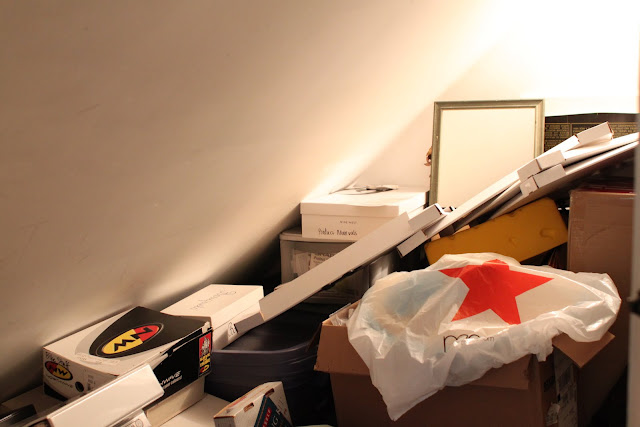
Some before pics. First, the closet. I could hardly open the door, much less get to the items that I needed...except the cheesehead. That was always within reach.


Next, the stuff waiting in line to be put in the closet.


The process
  1. Take everything out of closet
  2. Group items into appropriate categories. I used the following; donate, toss, will not need until we move, will need on an annual basis (Christmas decorations, winter coats), will need on a regular basis (luggage, gift wrap, sewing supplies, artsy stuff, filing cabinet).
  3. Once toss and donate items are set aside, consolidate boxes and bins (aka Tupperware or Rubbermaid storage bins). My goal is to not have to buy any more boxes or bins. For every item that is brought into the house, one must go! 
  4. Put items back in the closet starting with least used to most used.
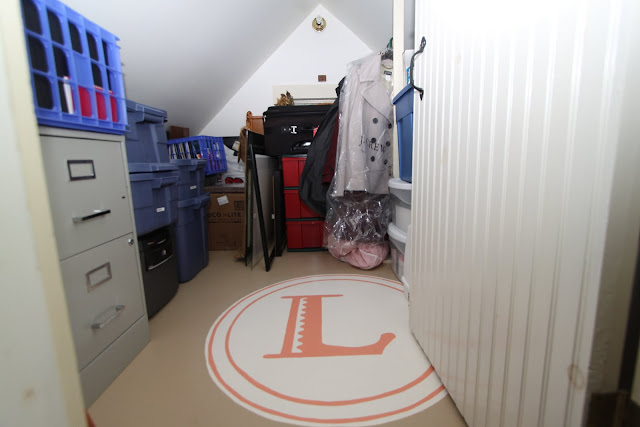
Here is the after status. Not exactly brimming with space, but I achieved my goal of getting all items needing storage into storage. I can also easily access everything that I need. Hooray!


Saturday, September 18, 2010

L is for Lotto

Share
As you may recall, I took it upon myself to clean out and paint the closet on the third floor of our house. The mid-project update can be found here. On a scale of easy-medium-hard, this project was medium. It would definitely have been easy if it weren't for the floor design and broken window!


Here are some before images of the closet after everything was removed. Also hiding behind some insulation was a broken window that we had repaired.


Since we have so much leftover paint from other rooms and projects, I decided to go paint shopping in the basement. Actually, Kevin asked me nicely if I would consider using up other paint so I thought I'd give it a try. Here is the line-up of colors that was entirely free as I got it from the basement store!


  • Ralph Lauren - Haystack for the floor
  • Restoration Hardware - Buttermilk for the walls
  • Benjamin Moore - Monticello Peach for the insignia
  • Benjamin Moore - Mayonnaise for the background of the insignia
  • Ralph Lauren - custom mix for the window trim
First I primed the floor and walls. The floor took 3 coats and the walls took 2. Since this closet is not full height and I am, this resulted in several bangs of the melon and much leg cramping. 


Then I painted the walls Buttermilk (2 more coats) and the floor Haystack (2 coats). The window trim was last and also took 2 coats. By this time, I was about ready to throw in the towel and forget the floor design, but since I came this far, I decided to keep on keepin' on.


I also mentioned in the previous post that I would be adding a design to the floor. For this, I needed some inspiration. Earlier this summer, Kevin and I attended the Lotto family reunion, also known as Lottofest. Lottofest came complete with a custom flag, a program of entertainment, good food and a dance party! Those Lottos sure know how to have a good time. Anyhow, I digress.


Here is the Lottofest flag that have me the idea to design my own L insignia.


Since I wasn't about to paint a chicken on the floor, I needed to put my own stamp on the design. Here is the stamp and sketch that I went off of. The stamp is from Paper-source and the sketch is from my big book of fabulous ideas.


Then, I set out to find an L monogram that I liked. I also found this at Paper-source although Anthropologie had several options as well. 


Once I had all of this down, I decided to make the outer diameter of the design 36". To establish the circles, I placed a screw in the center of the circle and used a pencil and string to draw it out.


I sketched out the L by measuring the monogram and multiplying the dimensions by 30. This gave me the rough dimensions and I sketched out the rest by hand. I painted the background Mayo, let it dry, then painted the inner circles and the L Monticello Peach. Any wah-lah the finished product!


I also think this would be a cute idea in a kid's room or above a headboard in the master bedroom.


I haven't even gotten to the real reason for the project and that was to organize the closet! Stay tuned.