Sunday, August 15, 2010

Deck TLC

Share
The surface boards on our deck used to be so rotten that when I left for work my heels used to get stuck in the wood. Luckily I never landed on my face, but it was a distinct possibility. 


As a result, Kevin and I tore up our patio last year. The frame looked great so we left it intact and replaced the surface boards with gorgeous mahogany decking. Yes, mahogany. It was important to Kevin so we splurged. I will blog more on this process in a bit, but for now, I am going to take you through the deck project we did this weekend. Trim painting and deck staining! Yesssss!


This weekend started out with a nice little Saturday and by this I mean a trip to Home Depot. To complete this project, we used the following materials:


Deck staining
  • Broom
  • Screwdriver
  • Wet/dry vac 
  • Hand brush
  • Bucket of soapy water
  • Old torn up shirts
  • Knee pads
  • Cabot Australian Timber oil stain in Mahogany Flame


Deck trim
  • Behr paint + primer in one. Exterior paint in satin finish. Color matched to Benjamin Moore's Mayonnaise (my favorite trim color used in several places throughout the house).
  • Electric palm sander
  • 100 grit sandpaper (1 sheet)
  • 2" paintbrush. Nice quality.
  • Safety goggles
  • Face mask
  • Earplugs

Other helpful items
  • 50 SPF sunscreen
  • Water
  • Sweet tunes - I am loving Pandora
  • A sunny and breezy weekend with temps in the mid-80s
After we gathered all supplies, it was time for lunch! So after lunch, we got to work. Some before pictures...
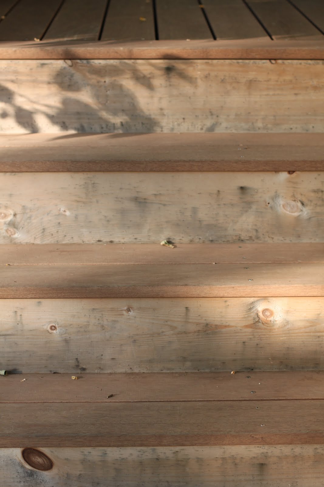


Staining the deck 
  1. Sweep the deck with a broom
  2. Clean between the deck boards with a screwdriver and wet/dry vac
  3. Brush between the deck boards with a hand brush (this may not be necessary, but we don't mess around!)
  4. Hand wash the deck boards with soapy water
  5. Rinse the deck
  6. Gently sand any blemishes (it is easier to see true blemishes after the boards are clean)
  7. Apply the stain with an old t-shirt and wipe off
Cleaning between the boards.

Brushing between the boards.

Hand washing the deck boards.


Staining the deck.

 A little contrast with and without stain.


Painting the deck trim
  1. Assess trim boards. If clean and decent, you probably do not need to sand. If they look anything like the ones below, you should consider sanding.
  2. Use the electric hand sander and 100 grit sand paper to sand the areas to be painted. Be sure to use the appropriate safety measures like a face mask, goggles and ear plugs.
  3. Wash the boards with soapy water and let dry
  4. Paint the boards. You will likely need 2 coats.
Before sanding.

After sanding. 


Carefully painting.


The stained deck after.


Close-up after.


If I were to do this over again, I would probably use wood filler on the trim boards where it needed it prior to painting. Overall, it was a pretty easy peasy project. Painting the trim took about 5 hours from start to finish once I had all supplies. It cost $35 for the gallon of paint which I used about 1/8 of. 

Staining the deck took the same 5 hours on Saturday for prep only plus about 5 hours on Sunday to stain. The cost was $30 for the gallon of stain which we used about half of. Our deck is 16 ft. by 13 ft. to give you an idea how long it may take you! 

My Sunday morning was spent at my favorite flea market, Todd Farm. Stay tuned for my tips on flea market shopping and my best finds to date! Cheers.

When shopping for our deck materials, we had a tough time deciding between real wood and composite. Please weigh in below on your preference.


Friday, August 13, 2010

Are you a fan?

Share
You know what I am talking about; the ceiling fan. Yes, the lighting fixture that every designer on Trading Spaces would rip straight out of the ceiling every.single.episode. I am fairly certain that my aversion to ceiling fans came from that show.


Then I got to thinking, what has the ceiling fan ever done besides make me happy? Ceiling fans are really quite excellent on hot summer days...and have we had hot summer days this year! They also provide white noise which is, in my opinion, a sweet sweet lullaby. The challenge has always been, where can I find a ceiling fan that is cool in both design and temperature?


Henceforth, I went on a quest to find a cool ceiling fan. Most big stores had the typical faux wood or brass finish types. And then I found it, the ceiling fan that was meant to be at Restoration Hardware. I typically reserve Restoration Hardware for pieces that I know will be permanent fixtures as they are an investment. So here it is folks, the ceiling fan that lulls me to sleep every night. 


The only downfall is that this fan does not provide much in the way of white noise, likely due to the high level of quality. Obviously, I will choose design over my sweet lullaby, but hey, that's just me!


Head on over to Restoration Hardware to check out their ceiling fan selection. I am really liking their entire line of ceiling fans. In fact, I do not think I've run into anything I do not like there.


And a few artistic shots for your viewing pleasure.


So what do you think? I'd love to get your feedback. 


Wednesday, August 11, 2010

Commander in Chic

Share
Have you ever purchased a nail color just because of the name? (Presumably, this question is for the ladies only.) I cannot say that I have, but if I am torn between two choices, I will almost certainly go with the one with the better name. I am thinking it works because I see it more and more. 


OPI is the master of nail polish names, but recently I have really been loving Sally Hansen's Complete Salon Manicure line. Some of the intriguing names include Commander in Chic and Back to the Fushia. I did not really like Back to the Fushia, but I nearly bought it because that is a pun on the movie that makes time travel possible. The thing that really impressed me though is their awesome brush. They have somehow designed it so that you get a flawless, just stepped out of the salon with a manicure, look every time. Good stuff. 


Anyhow, the real reason I am telling you all of this is because I think nail polish colors are another unexpected source of inspiration for the home. They are typically bolder than what you might put on your walls, but I think some of the colors would make for amaaaazing accent pieces. For example, a bedframe in Right Said Red (color on the left) or a desk or bookcase in a girl's room in Commander in Chic (color on the right). 

Tuesday, August 10, 2010

Fauxidermy

Share
I grew up in the midwest where it is not unheard of to have a dear head or some other mounted animal head as the focal point in the living room. Incidentally, you may also find them sitting next to you on the couch, although this is much less common.


I have to admit that I also know all of the words to 'Turdy (yes, that is really how you spell it) point buck' from Bananas at Large. It is not that I like this kind of music, it is just that I did not have a choice. My dad is an avid hunter and played this song repeatedly in the car during hunting season. I have never been into hunting despite my father's attempts and I certainly have never been a fan of dead animals on the wall! Have you ever seen one of these things? I swear their glass eyes follow me wherever I go. Heebee. Jeebees.

Enter: fauxidermy. A term that as far as I know was coined by Z Gallerie (love them!). A much lighter, less-destructive form of animal art. Fauxidermy can be found in many different forms including resin, cardboard and recycled cement bags? Z gallerie offers the resin versions and wow, inventive is all I have to say about recycled cement bags. Check out the recycled cement bag giraffe version at Anthropologie which would be cute in a little kid's room. Anthropolgie also offers a zebra, rhino and gazelle. Who needs an African safari? 


I recently renovated our guest bedroom and found a cardboard deer version at Cardboard Safari. There are different sizes of moose, deer, bison, rhino and elephants available. Aside from the more obvious animal-friendly benefits, my cardboard version did not break the bank at $28 for a medium version. Go ahead, I dare you.

Saturday, August 7, 2010

Mini Philanthropist

Share
The other day I heard an inspiring story that I thought would be great to share. Helping others in need or those less fortunate is such an admirable, selfless act in my mind. I am not even talking about donating billions of dollars like the great Warren Buffet or Bill and Melinda Gates, but rather bringing a smile to the face of someone that needs it.


Here's the thing. The story that I stumbled upon was led by a child. I am so humbled and impressed by the mission of this little one!


The story is of a little girl named Hanna who was diagnosed with a rare form of cancer, stage four Burkitt's Lymphoma, when she was 7. She experienced all of the sad and nasty things that come along with this kind of diagnosis, but has turned this experience into an opportunity to help others. She is 9 now and doing well! To read more of her story, you can check out her website here or read up on the story that the local new station published here.


Hanna was granted a wish by the Make-A-Wish Foundation to Disney World which was a wonderful experience for her. Hanna's Hearts of Hope is an organization that sells necklaces to raise funds for the Make-A-Wish Foundation of Massachusetts and Rhode Island. The necklaces are supercute and made of walnut and melted crayons. This little girl is creative to boot! If you would like to help her reach her goal of raising enough funds for 10 wishes or check out her creations, you can do so here.


*Images from Hanna's Hearts of Hope website.

Wednesday, August 4, 2010

First know all of the rules, then break them

Share
Don't get me wrong, I am pleasantly surprised when mistakes turn into something fabulous. The trouble is that I rarely know how the mistake turned into a positive outcome. However, deliberate mistakes are easier to track and repeat! For example, my first photography class was called visual perception. During the first class we were told to go out and take blurry photos. Whaaaaaa? I love ubersharp photos! I'd have it no other way.

The class stumbled back with, well mostly blurry wierd images, but everyone had at least a few that just worked.

Lesson learned; it is ok to break the rules, it even makes for unique images or interior design or whatever else suits your fancy. However, to achieve best results and maybe even end up with something better than if you stayed on the straight and narrow, you must know the rules, so that you can break them effectively! 

I hope this makes some sort of sense and is not total jibber jabber. Here are a few examples to help me articulate my point.

Would this image be stronger if it were blurry or sharp? 


Ok, now this is strange. I was looking at this photo thinking about which rules it could possibly be breaking and then I read the caption. This is a small space that is painted with an oil-based metal enamel called Oregano Green (Benjamin Moore 2147-10) resembling a lacquer (per HGTV site). Note to self! Must investigate this so-called metal enamel, it sounds fierce (in the words of Christian Siriano from Project Runway's fourth season). 

.


Tuesday, August 3, 2010

Paper-Source design inspiration

Share
I have loved art stores ever since I can remember. Did I say love? I meant loooooove! These stores do not just provide art supplies, they can also serve as an unexpected source of inspiration. I could spend hours walking through the aisles and gazing at the colorful papers and paints. When most kids were playing house or playing with their My Little Pony or Care Bears, I was playing with the stuff in my 'art box.' Even thinking about that box now makes me happy!


My latest favorite is the Paper-Source. I even know where to park in the underground Boston Common Parking Garage so that I come out on the corner closest to the shop on Boylston Street. 


The colors of the stationary have great potential as wall colors. I chose a gorgeous deep blue called 'lake' as an accent wall for my guest bedroom re-do. (More details in a post to come.) You could also use some of the bolder colors for a dresser, dining room chairs or any other accent for a pop of color. Other colors that I find fabulous for wall colors are pool (love at first sight!), cement, khaki, chocolate, gravel, sage, leaf, chartreuse and luxe glass. Accent colors that will give your pad a little more spice-say are strawberry, papaya, poppy, fushia (for the really daring!), plum, beet, grape (instant attraction) and curry. Paper-source offers their latest swatchbook on their website. As I mentioned here, it is really easy and remarkably accurate to have anything color-matched at your local hardware store. 


The graphic art papers can be used as wall art or frame mats. I can even imagine using some of the drastic wrapping papers as inspiration for a wall design. Hmmm...now we're talking!


If you don't have one near you, you can always check it out and order online!

*Images from paper-source.com.

Monday, August 2, 2010

If J.Crew made pillows, this is what they would look like

Share
If you haven't checked out etsy, it is about time you do! It is an excellent place to browse for unique homemade goods. Sellers post items and we can buy them. They sell everything from photography to lamps to paintings to clothes, etc. Pretty much anything you can think of really.


I recently found a seller called dedeestsyshop that has beautiful pillows in all sorts of vintage and muted colors. I have no idea what inspires this artist, but these pillows really look like something that J.Crew would sell...and have I mentioned that I love J.Crew? 


These pillows would make great accents on a bed or neutral couch. They are also available in several sizes and another benefit of many etsy shops is that they take semi-custom orders (i.e. you want this pillow, but with a light grey background, convo the seller and just ask).